Personal Branding
Personal Branding
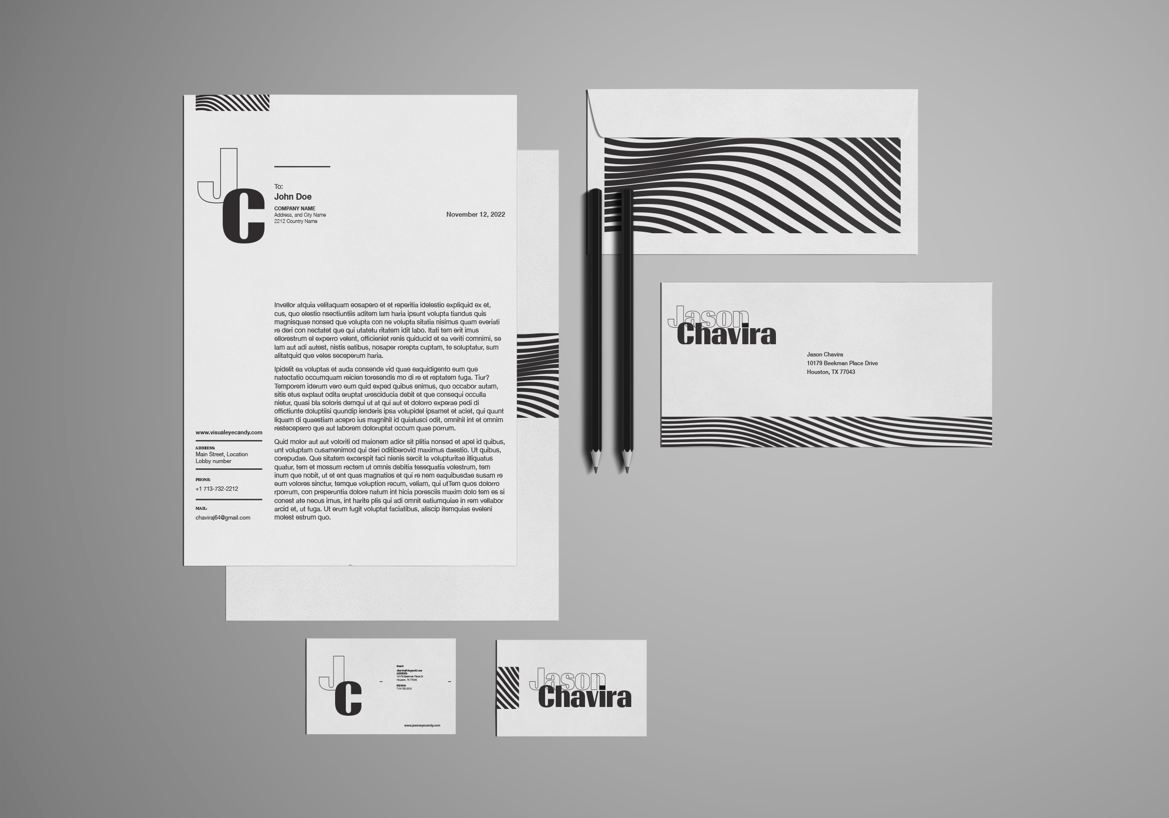
This project was part of my Type and Design class taught by Jaime De Vega. This project was arguably the best in the class because I got to mess around with my name to create all kinds of logos for my personal brand.I chose a professional black-and-white color scheme with sharp edges for my name and logo to show my clients that I am a serious designer. I also wanted to incorporate my fun and quirkiness by creating squiggly lines on parts of my designs to show a silly mood besides being a professional designer with great skill.
Process
This project took more than two weeks to complete. I broke the project down into many achievable small steps, the first being a logo exploration. In the logo exploration phase, I took my name and placed it in different order in Illustrator to brainstorm ideas. I also considered the acronym of my name, "J.C," when exploring logos. The type font I used for the acronym logo is "Timonium." You can access this typeface through Adobe fonts, and it is very sharp-edged with sharp, streamlined edges.
Meaning
I incorporated my "character" in my branding. How, you ask? Let me explain how the shapes that create my brand express who I am. Look at my name closely; what do you see? Sharp lines and edges that create the logo and my name. The sharp edges show how much of a clear vision I have when creating graphics and how much attention I pay to details. The typeface that makes up most of my brand (Timonium) has the same characteristics that show professionalism and neatness. My brand also has a graphic design to contrast the sharp and straight lines presented throughout my brand. The meaning behind the loose and free-forming lines is to represent my fun and creative characteristics. Although I am a very serious and professional designer, I also have a fun and creative side that thinks outside the box to give a fun, exciting flavor to all my client's designs.